Available for new projects · Amsterdam
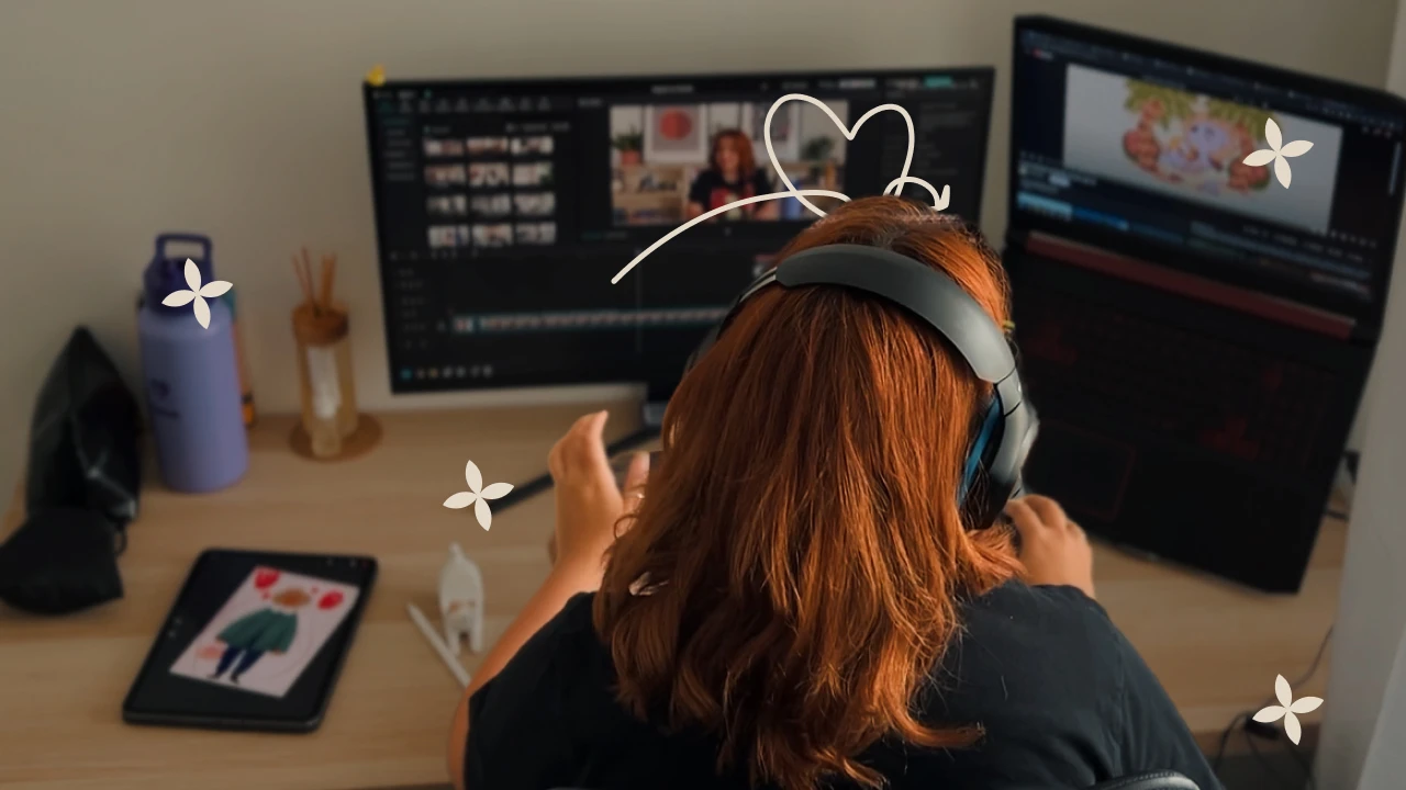
Product designer crafting design systems & DesignOps at scale.
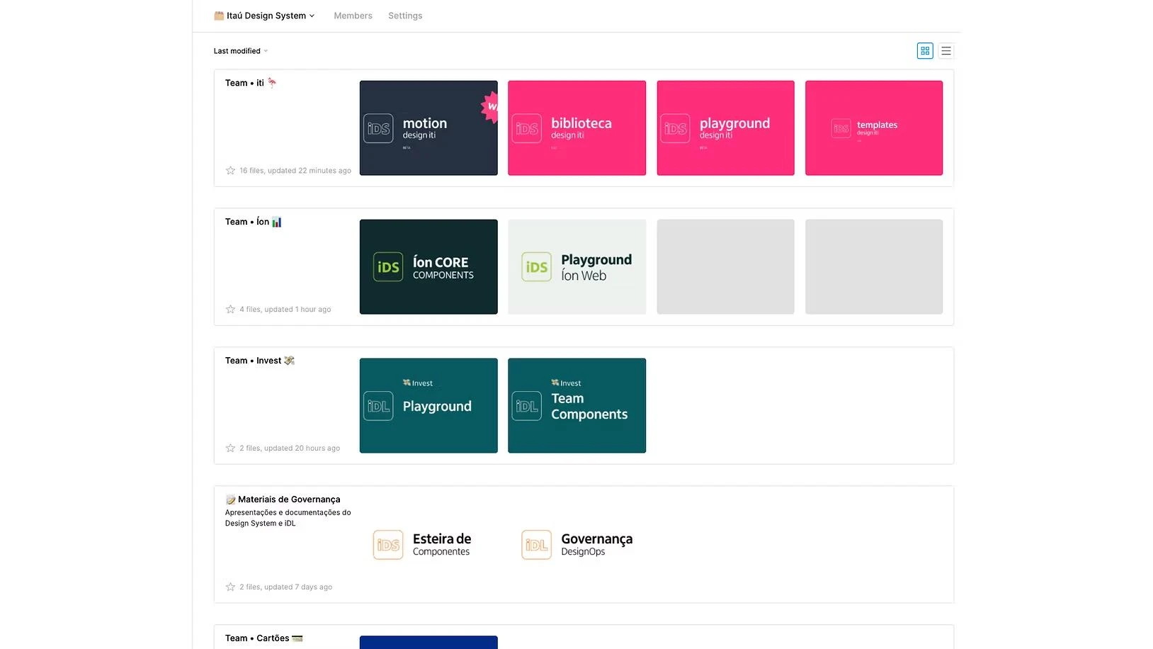
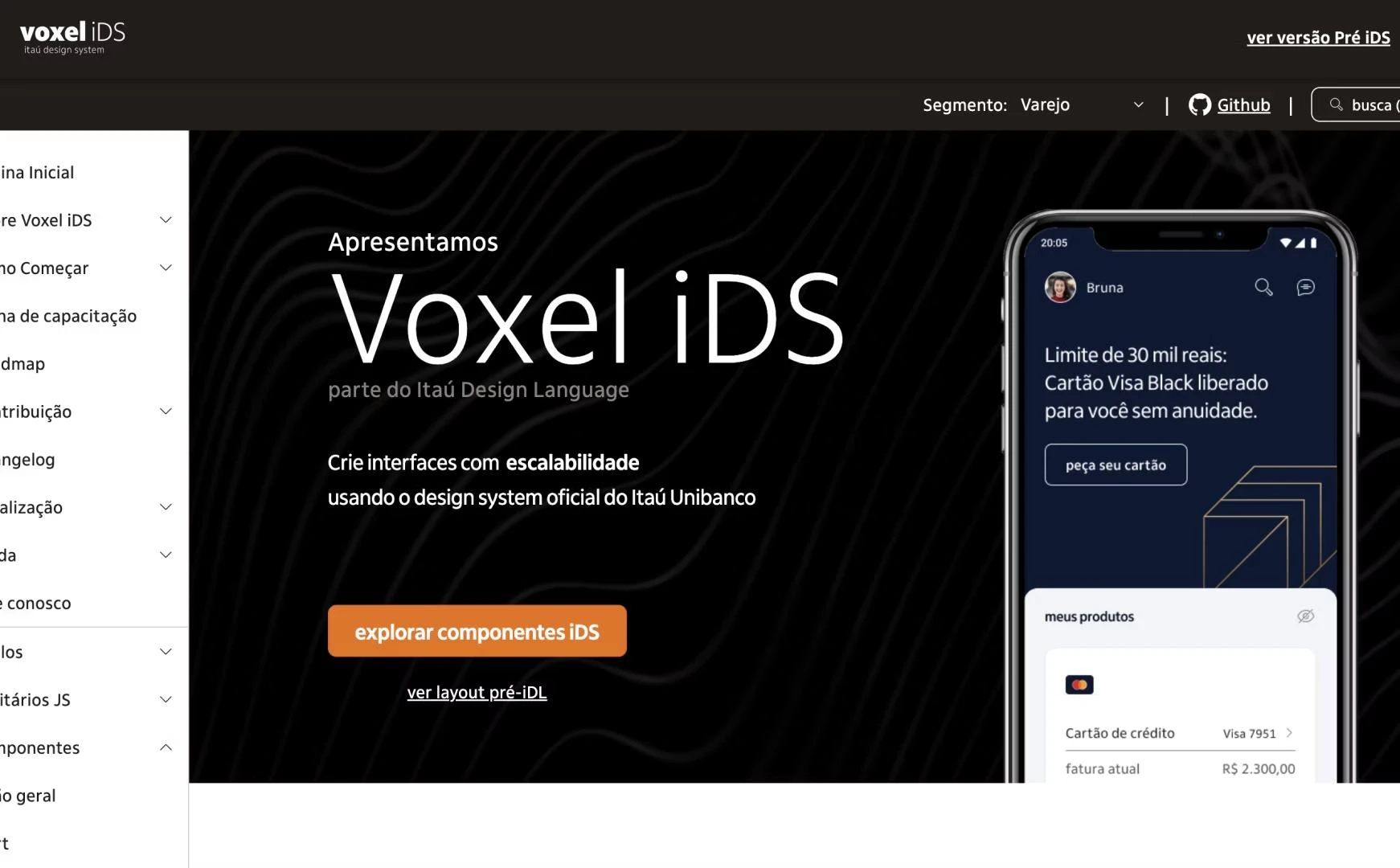
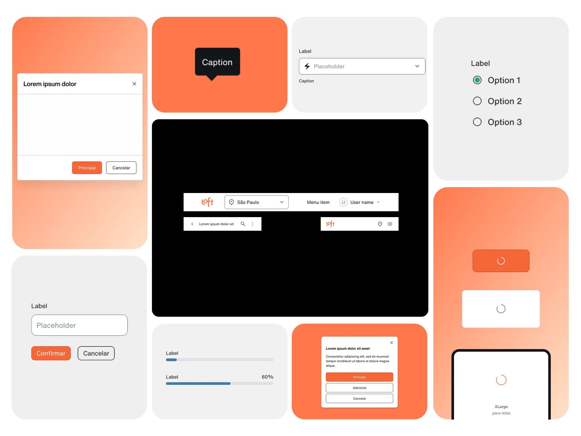
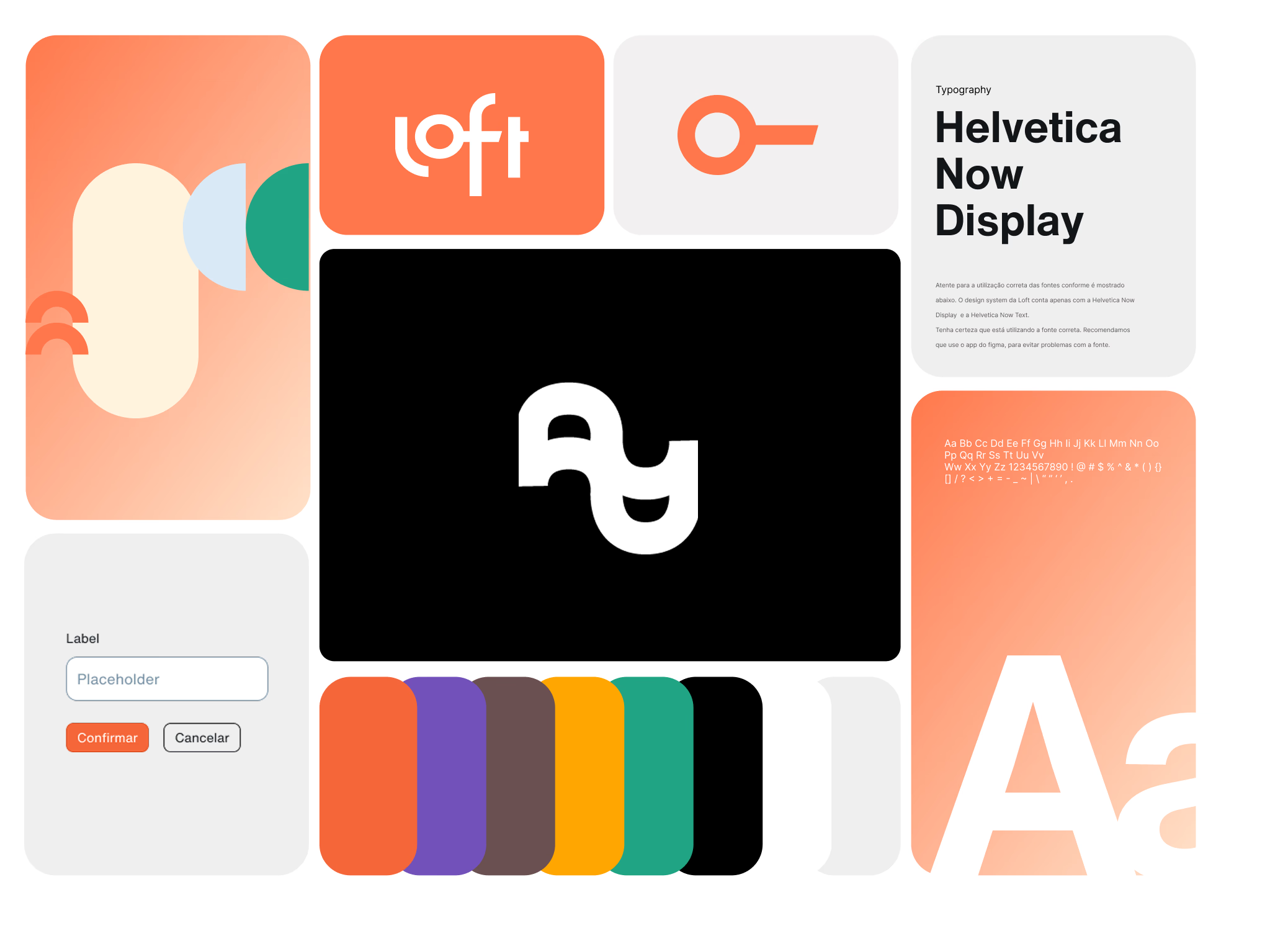
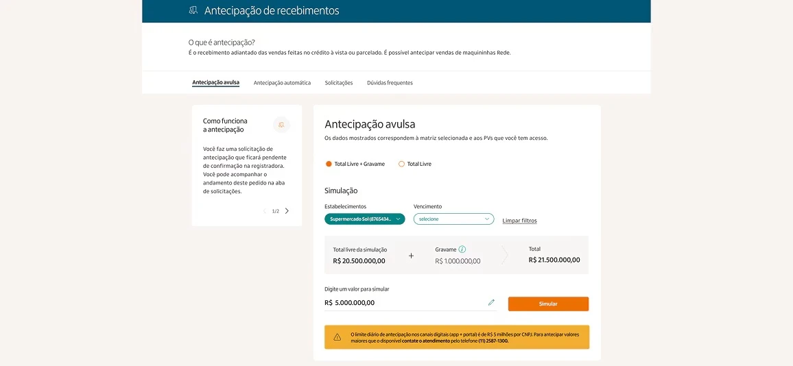
Scalable, accessible, human-centered frameworks that help teams ship better, faster, and more consistent digital products. 7+ years at Itaú Unibanco & Loft across 22+ brands in Latin America.
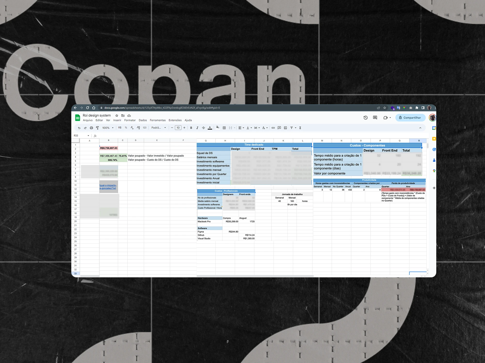
R$9.7M
Saved
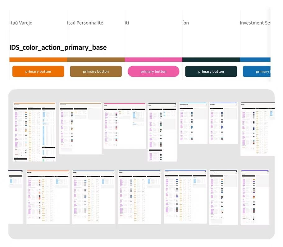
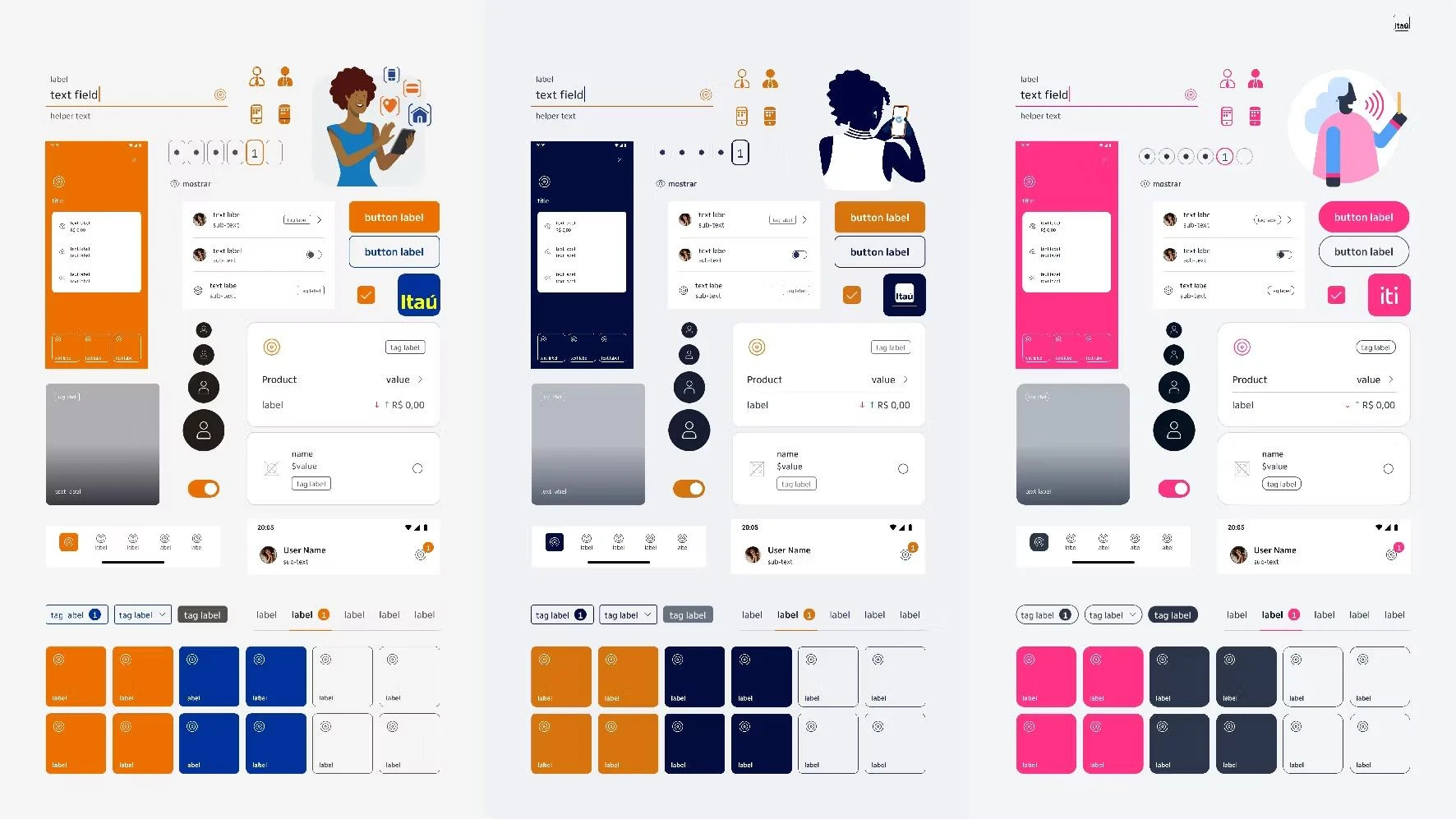
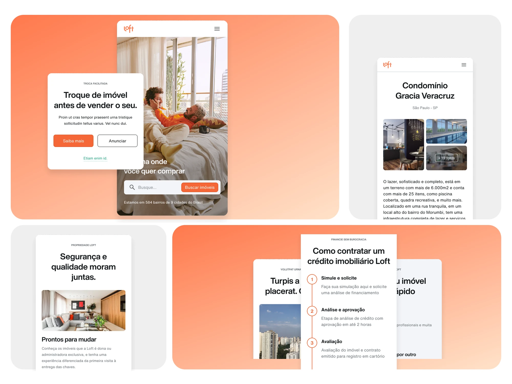
22+
Brands
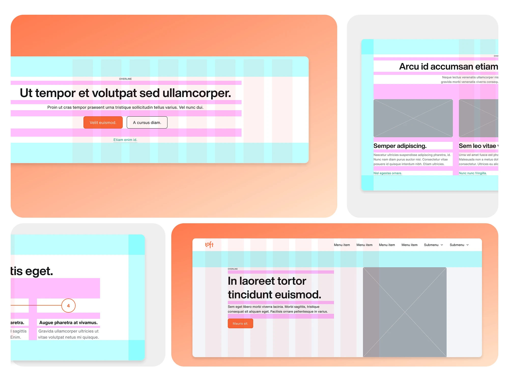
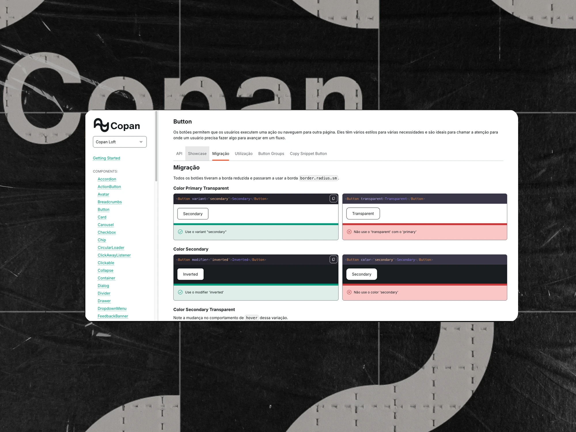
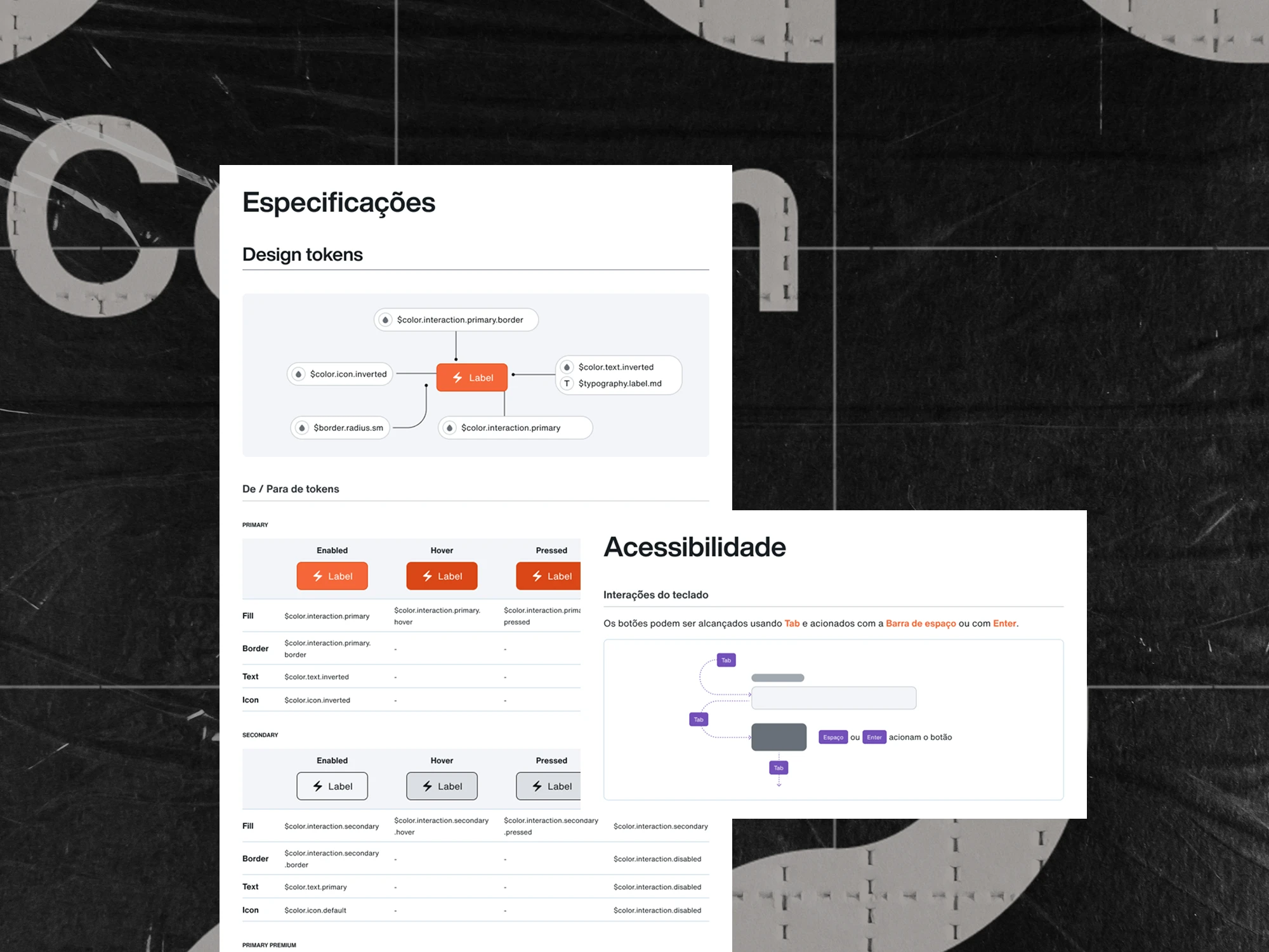
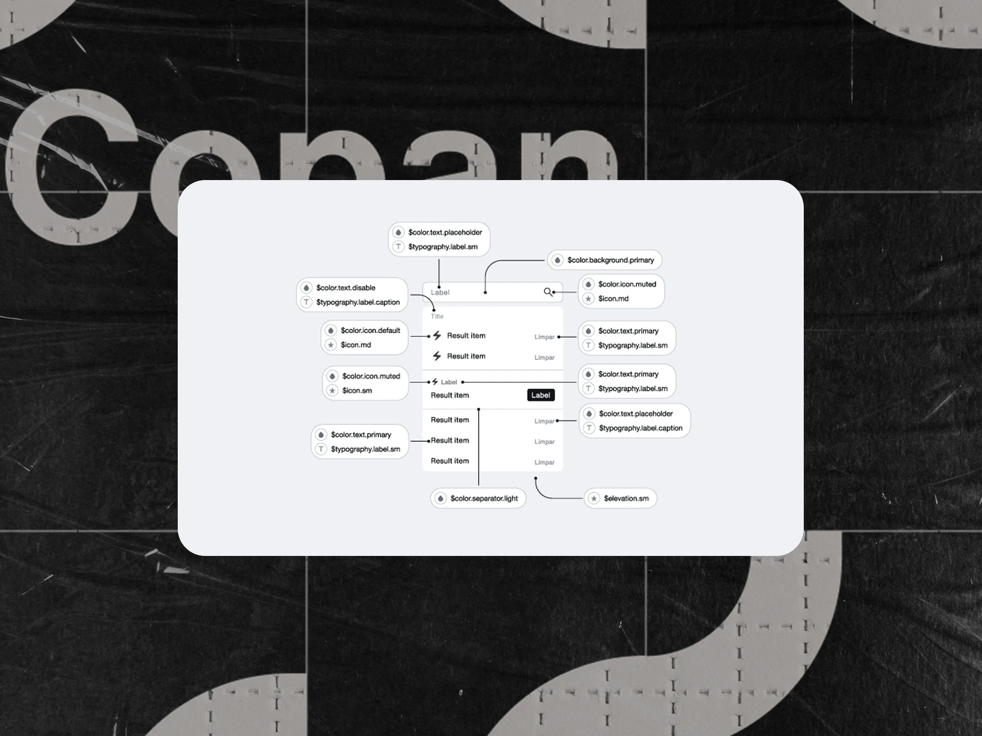
70+
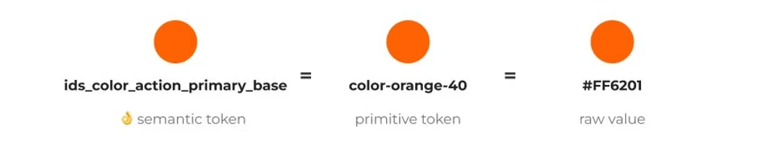
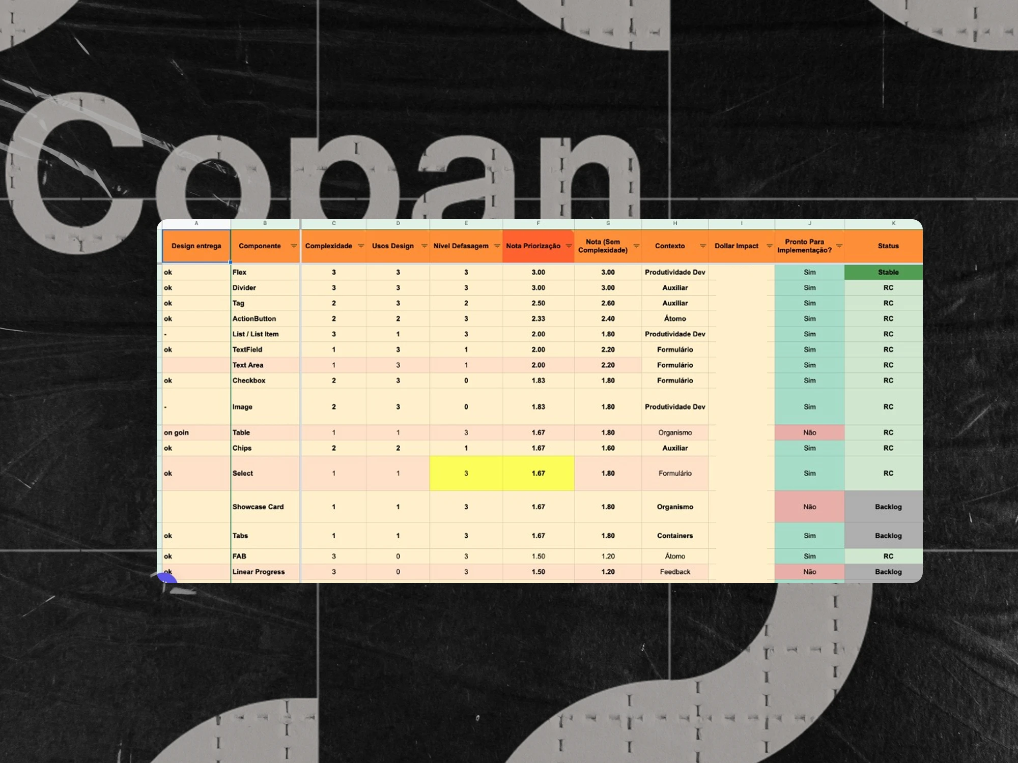
Components
View selected work →
About me
Featured projects
See all (08) →
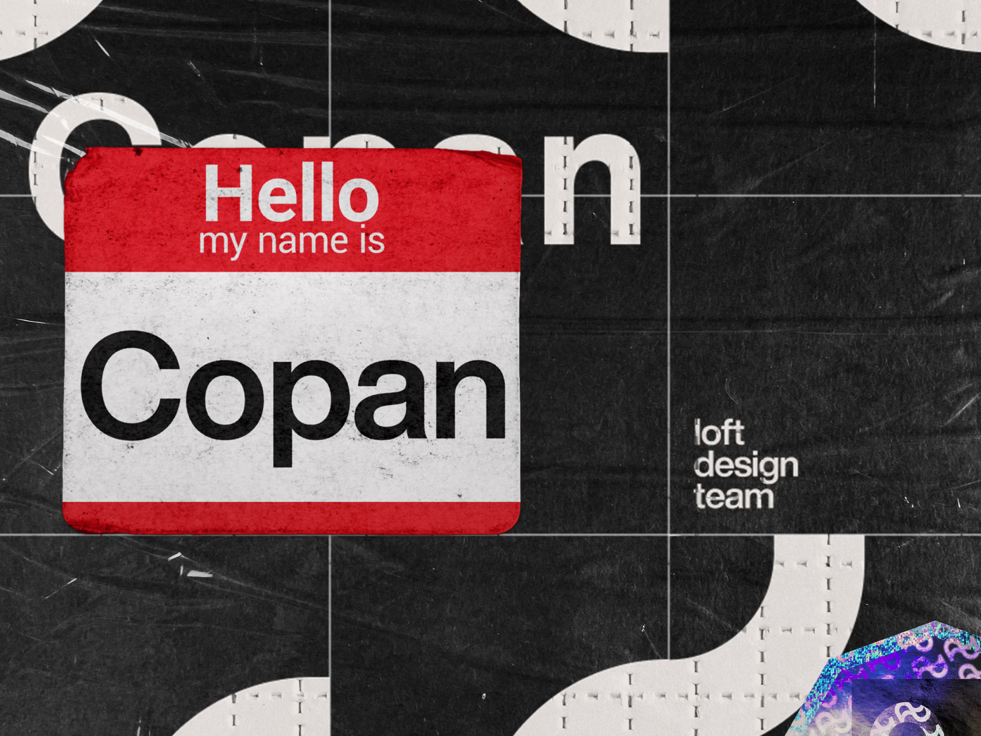
Trusted by teams at
Itaú UnibancoLoftRede+ 22 brands across LATAM
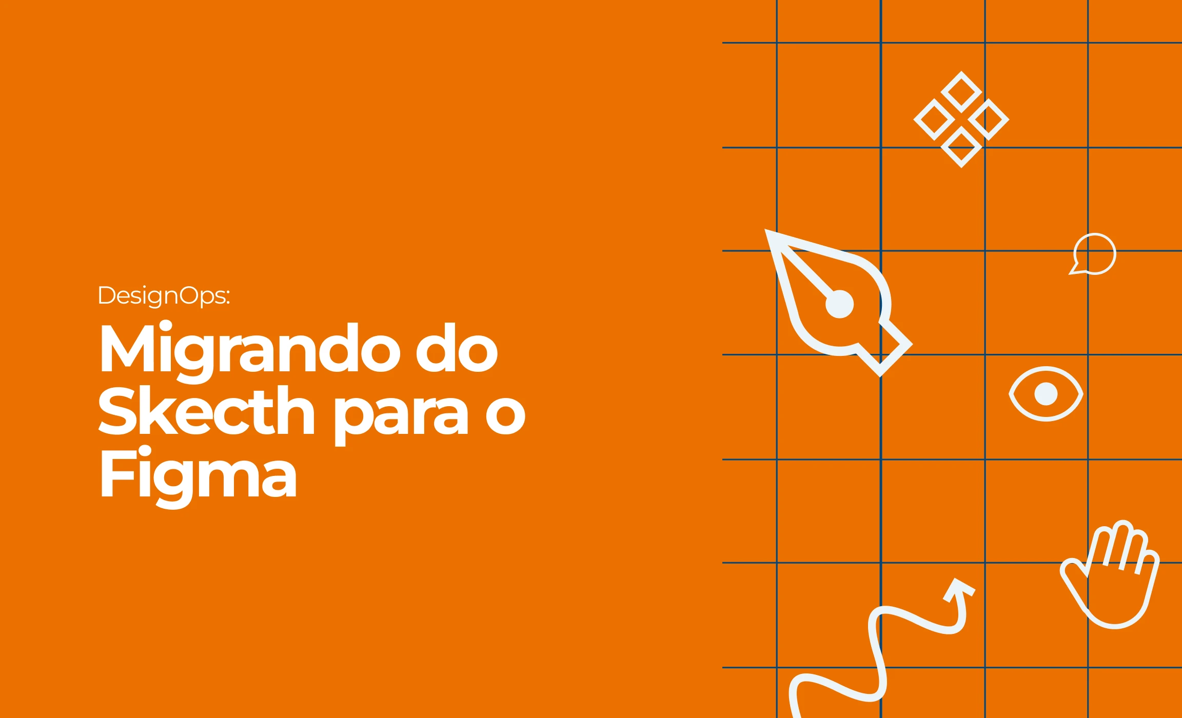
Writing
All articles →
What colleagues say
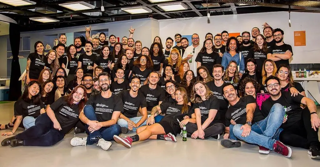
“I worked with Dri for nearly four years on the Design System and Ops team at Latin America’s largest bank. She supported over 400 designers with deep technical knowledge, empathy, and clarity. Together, we led a high-impact tool migration and managed component libraries, documentation, and access. Dri is the perfect balance between human-centered thinking and technical excellence — a rare and valuable asset to any Ops team.”
Vinicius Perussi
Senior Design · Itaú
“I highly recommend Adriana for her product design expertise, especially in design systems. At Loft, she collaborated closely with our dev team and stood out for her honesty, clarity, and constructive feedback. Her transparent communication helped us improve processes and deliver better outcomes. A pleasure to work with!”
André Seiji
Software Engineer · Frontend, Design Systems · Loft
“Adriana is one of the most skilled and reliable professionals I’ve worked with. She combines strong design fundamentals, tool mastery, and high-quality deliveries with a positive, collaborative attitude. She’s generous with her knowledge, open to feedback, and a true team player. Any team would be lucky to have her.”
Marcelo Meinberg
Squad Leader / Product Manager · Loft